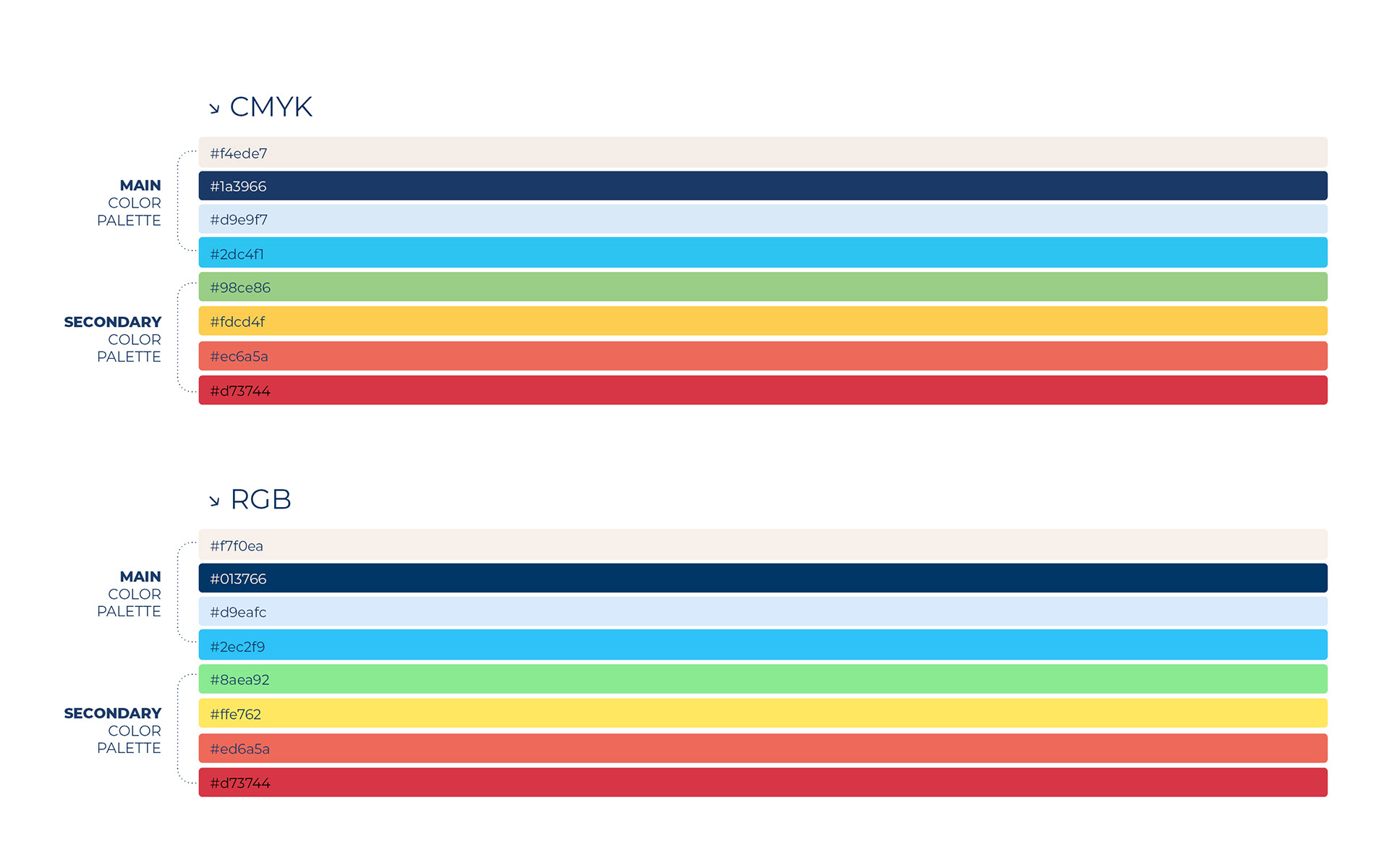
Defining the color palette was an important part of the overall rebrand, not just at the interface level. The challenge was to maintain a professional and trustworthy tone - especially for a medical audience - while introducing freshness and energy that would modernize and differentiate the brand. I established a solid, neutral foundation and layered in carefully selected accent colors to create hierarchy, category distinction, and visual interest. This balance between color and professionalism is a guiding principle in my work - combining clarity and credibility with vibrancy and a contemporary feel.
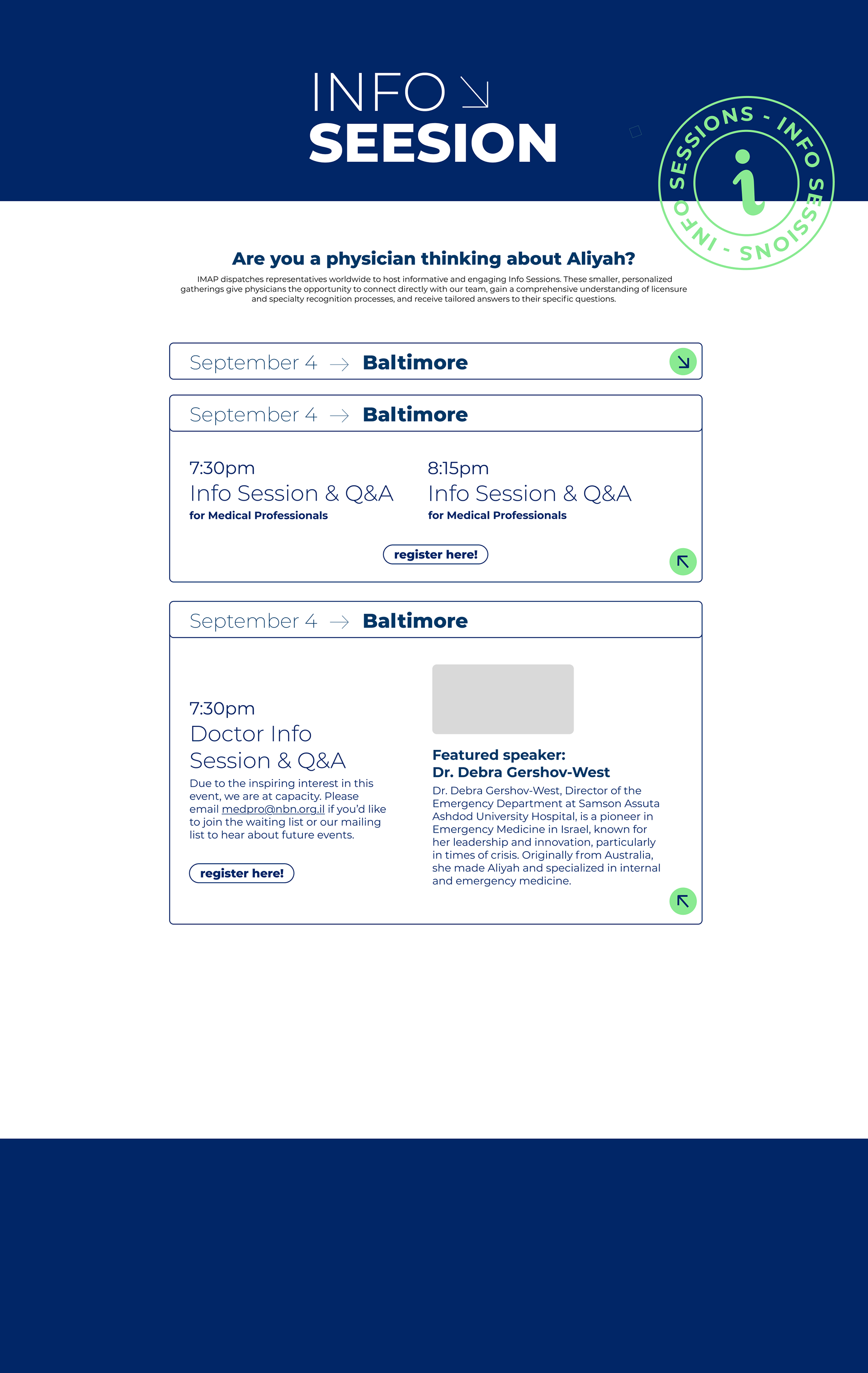
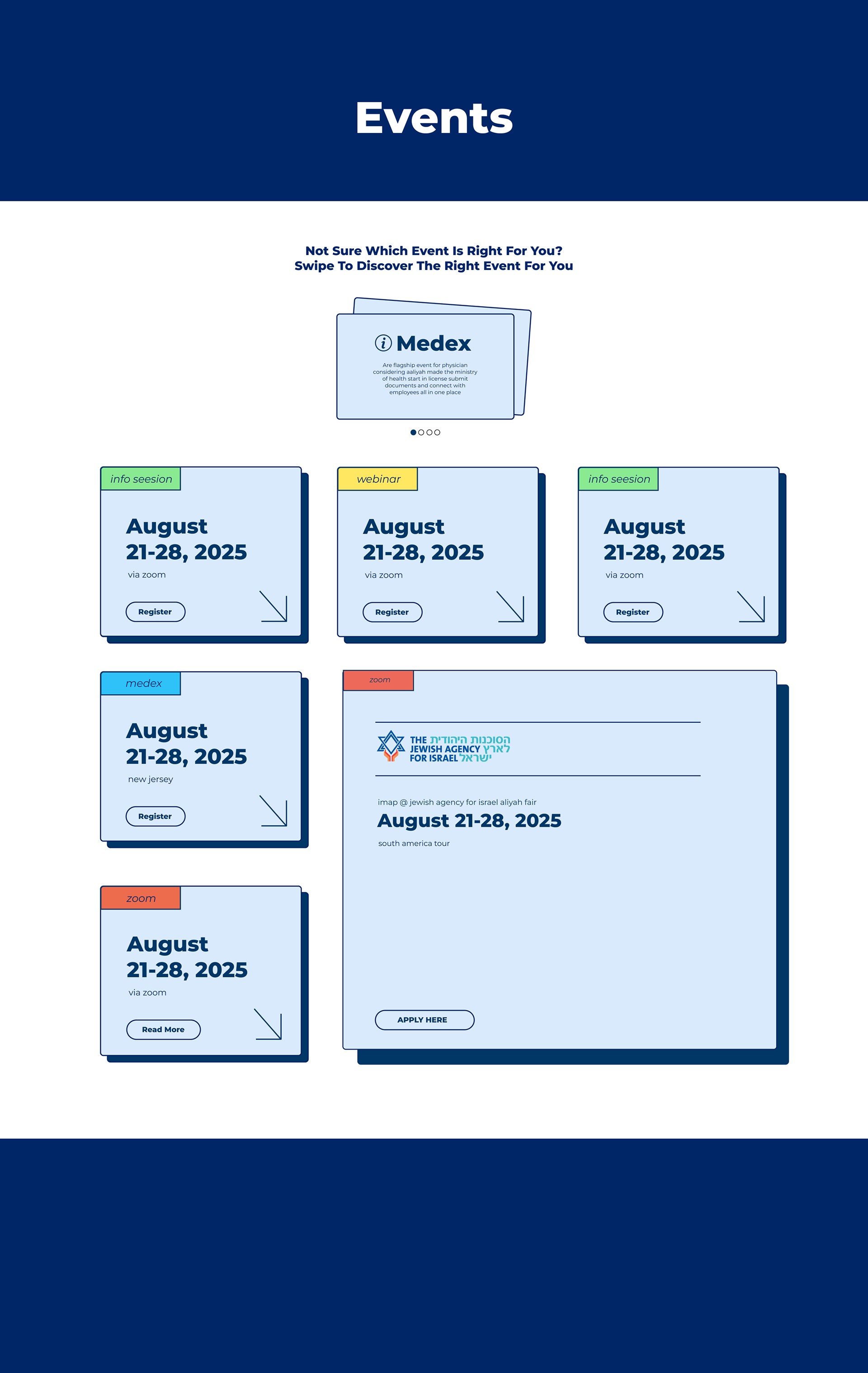
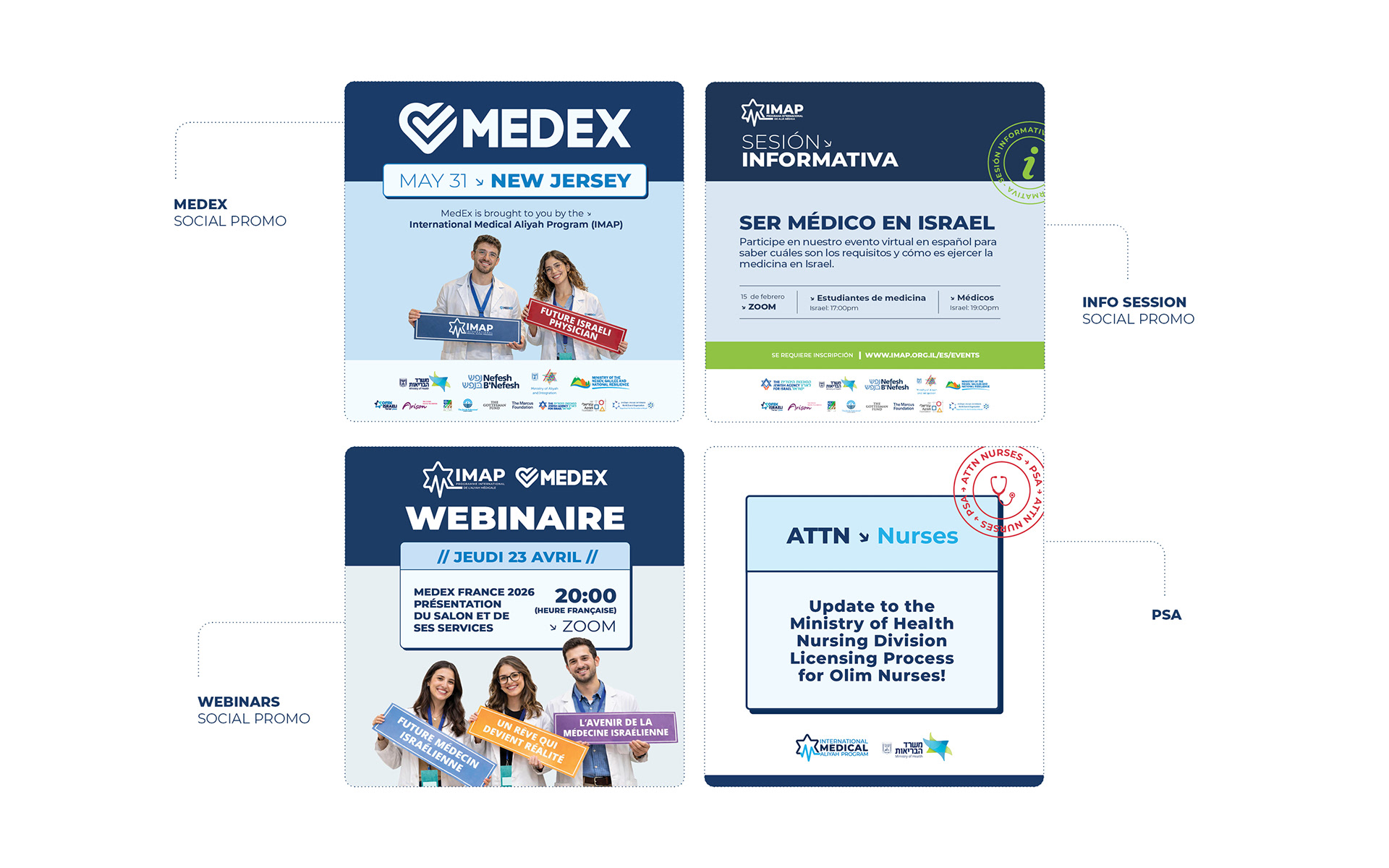
These pages were originally separate landing pages outside the main website, creating a fragmented and inconsistent user experience. The challenge was to unify them into one clear and accessible system that could support a large volume of events and content without appearing heavy or overwhelming. I developed a modular, scalable structure based on expandable components - each event is presented as a clean, designed container that reveals extended content, logos, and imagery when needed. The layout maintains a solid and professional foundation, while subtle touches of color reinforce hierarchy and strengthen the overall brand language.
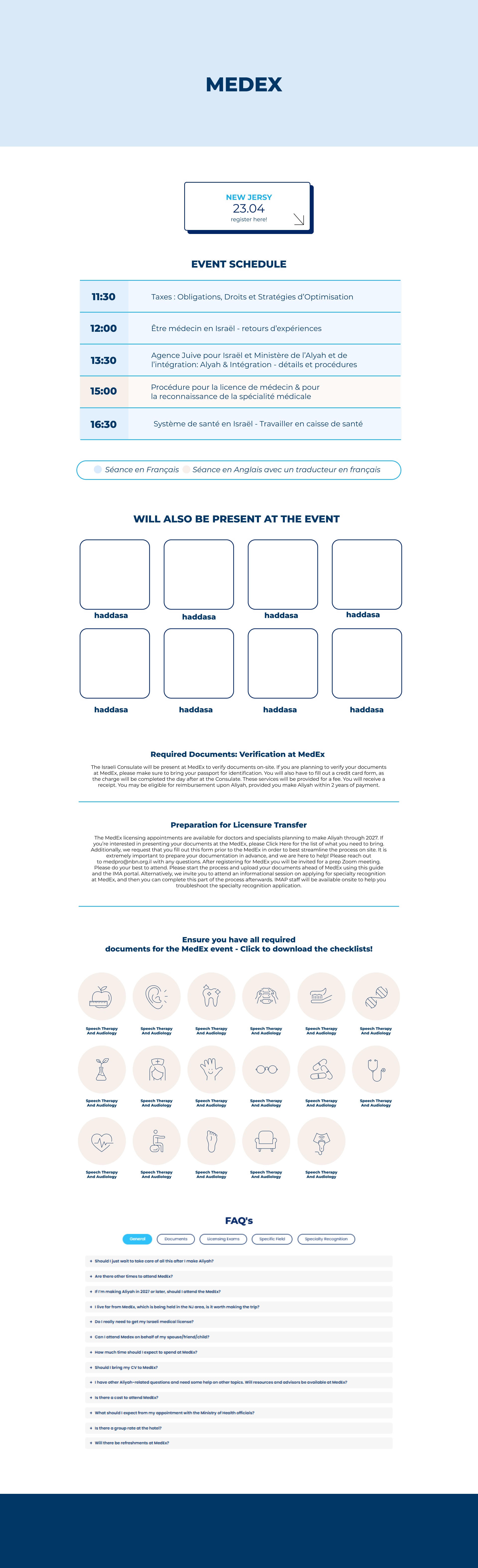
The MedEx event page presented a structural challenge. Previously, each event existed as a standalone landing page, and when no event was active, MedEx content became inaccessible, creating a lack of continuity and discoverability. I addressed this by designing a two-layer architecture: a permanent MedEx hub page alongside dedicated internal event pages. The internal page includes the schedule, vendors, tailored content for different physician groups, and icon-based navigation that allows quick identification and direct access to relevant materials and downloads. This structure improves accessibility, maintains brand continuity, and ensures long-term content visibility beyond a single event cycle.
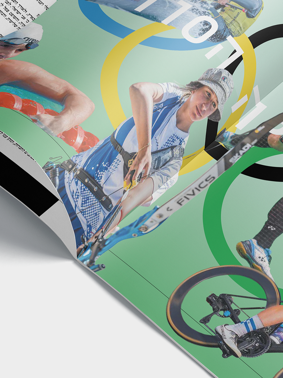
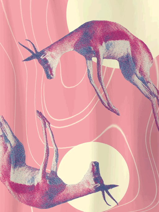
The brand system was designed to scale across platforms and additional branded assets, ensuring long-term consistency and a cohesive visual presence.